Data View Options
Tiles will, by default, choose one of three ways to draw a signal based on the data inside that signal.
| Summary | Line Graph | Map | Bar Graph | Pie Graph | Gauge Graph | Histogram |
Auto-Populated
The following is an explanation of the logic that Tiles initially uses to classify each signal.
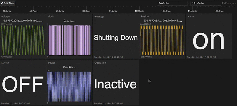
Summary

Signals that would be drawn as flags, bits, or digital string buses in Waves initially display "Summary: Last Value" in Tiles. This includes signals that have only a single value that is repeated over and over (e.g. on, on, on), signals that have only two values that are "truthy" and "falsey" in nature (e.g. on/off, up/down, enter/leave, 1/0), and signals that contain non-numerical values that can't be described by either of the previous descriptions.
Other settings for the Summary view include showing numerical average, min, max, median, and mode (most frequent).
More information about the Summary view and its options can be found here.
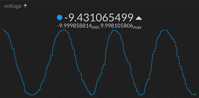
Line Graph
Signals that would be drawn as spark lines in Waves initially display as a "Line Graph" in Tiles. These are signals that contain only numerical values. Integers, floating point numbers, and fractions are all auto-detected as numerical values.
More information and options for the line graph view can be found here.
Map
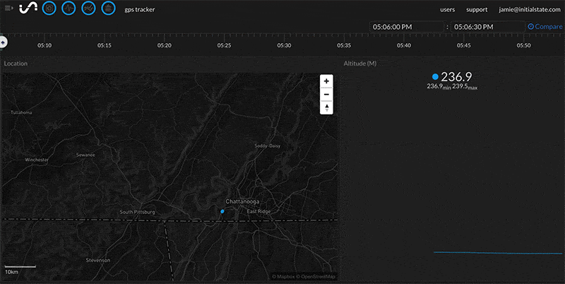
Signals containing location data will be drawn on the Map tile view by default. The map will only recognize location data in the form of Decimal Latitude and Longitude (36.1667,-86.7833) or Degree, Minutes, Seconds (36° 10' 0" N 86° 46' 0” W). The location data must be sent as one data point.
More information about the Map View can be found at here.
Other View Options
Tiles offers several more view options in addition to the two defaults listed above. You can select the way you'd like each individual signal displayed by first right-clicking on the desired tile (or long press if you are using a touchscreen device) and selecting Edit Tile from the pop-up menu, then choosing the desired view in the Tile Type drop-down menu:
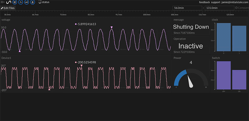
Bar Graph
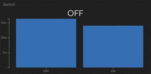
A bar graph displays either how long in time a signal is a certain value or the count of the different values in a signal.
More information and options for the bar graph view can be found here.
Pie Graph
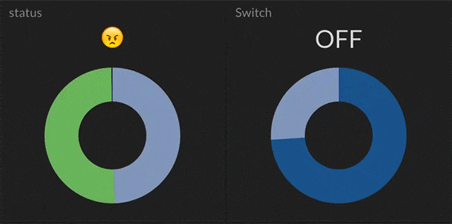
A pie graph visually shows what percentage of a signal is a certain value either in total time or unique event count. Hovering over each slice will display the value of that slice.
More information and options for the pie chart view can be found here.
Gauge Graph
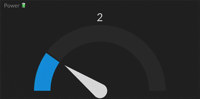
The gauge graph displays the current value of a signal in relation to that signals minimum and maximum value or the value range specified in the tile configuration.
More information and options for the gauge view can be found here.
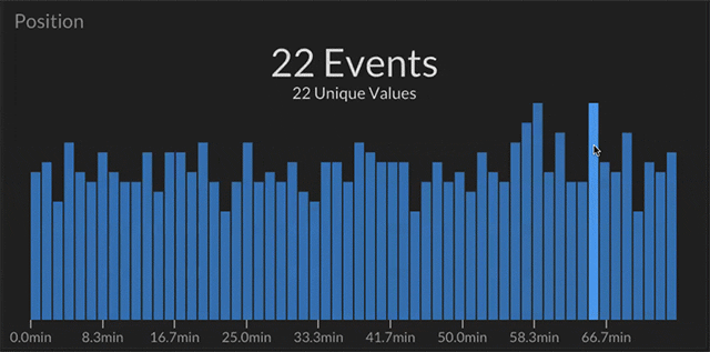
Histogram

A histogram shows how many unique events occurred during a specific time period.
More information and options for the histogram view can be found here.