New Feature Releases:
November 13, 2020
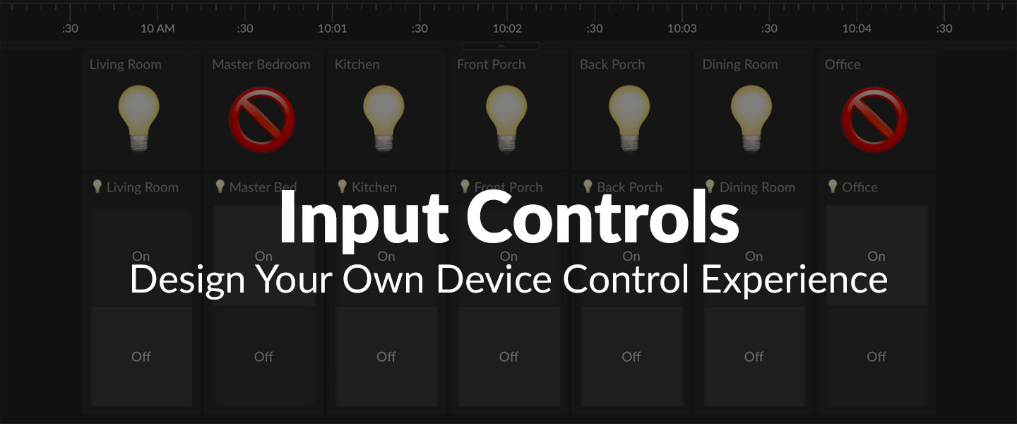
Input Controls
Being able to control things directly from a Tiles dashboard has been one of the most requested Initial State user features. You now have the option to add four new input control tile types to your dashboard - button, switch group control, range control, and text field control. When combined with the Initial State Read API, input controls give you the ability to design your own device control experience on either a desktop or mobile device. More info ...
October 26, 2020
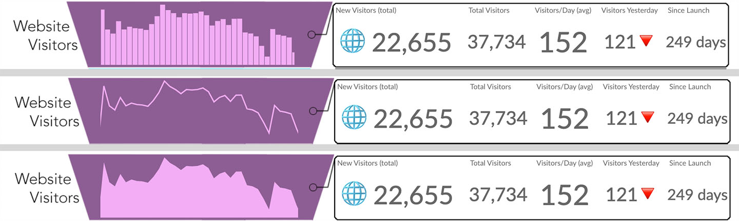
Histogram Draw Styles
You can now specify the draw style for histograms in Tiles. Histograms can be drawn as bar, line, or area draw types depending on your style preference. More info ...
October 6, 2020
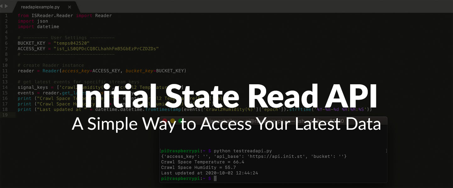
Initial State Read API
Initial State has always had an incredibly easy-to-use API for streaming data into your account. What has been missing is a similar API for reading data out of your account. That gap has now been filled with the release of the Initial State Read API. You can now enable read access to any of your data buckets and read the latest value from any data stream with a single API call. We have also released a new Python module to make accessing the Read API even easier. More info ...
September 5, 2020
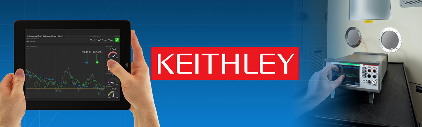
Integration with Keithley DAQ6510 and DMM6500
A native integration between the Keithley DAQ6510 and DMM6500 instruments with Initial State is now available. This integration gives a DAQ6510 / DMM6500 remote monitoring capability, real-time interactive dashboards, triggering and the ability to share data — all without the need for a PC or external software. More info ...
July 18, 2020
Line Graph Drag Zoom
You can now zoom into an area of a line graph in tiles using left click -> drag. This will zoom your entire dashboard into the specified time range. More info ...
May 9, 2020
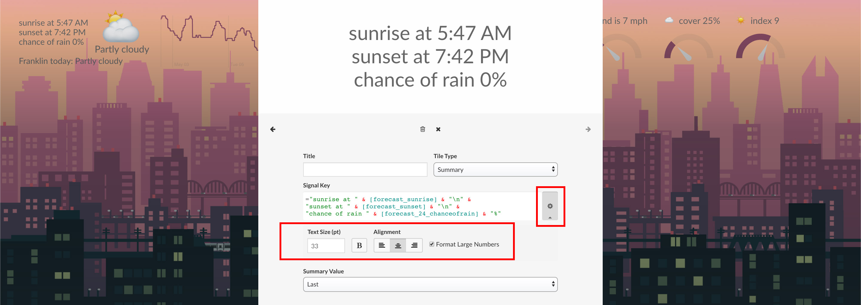
Summary Tile Text Formatting
You can now format text in the summary tile with options including text size, alignment, weight, and large number formatting (e.g. 1,000,000). You can also insert line breaks for multi-line summary tile views. More info ...
April 7, 2020
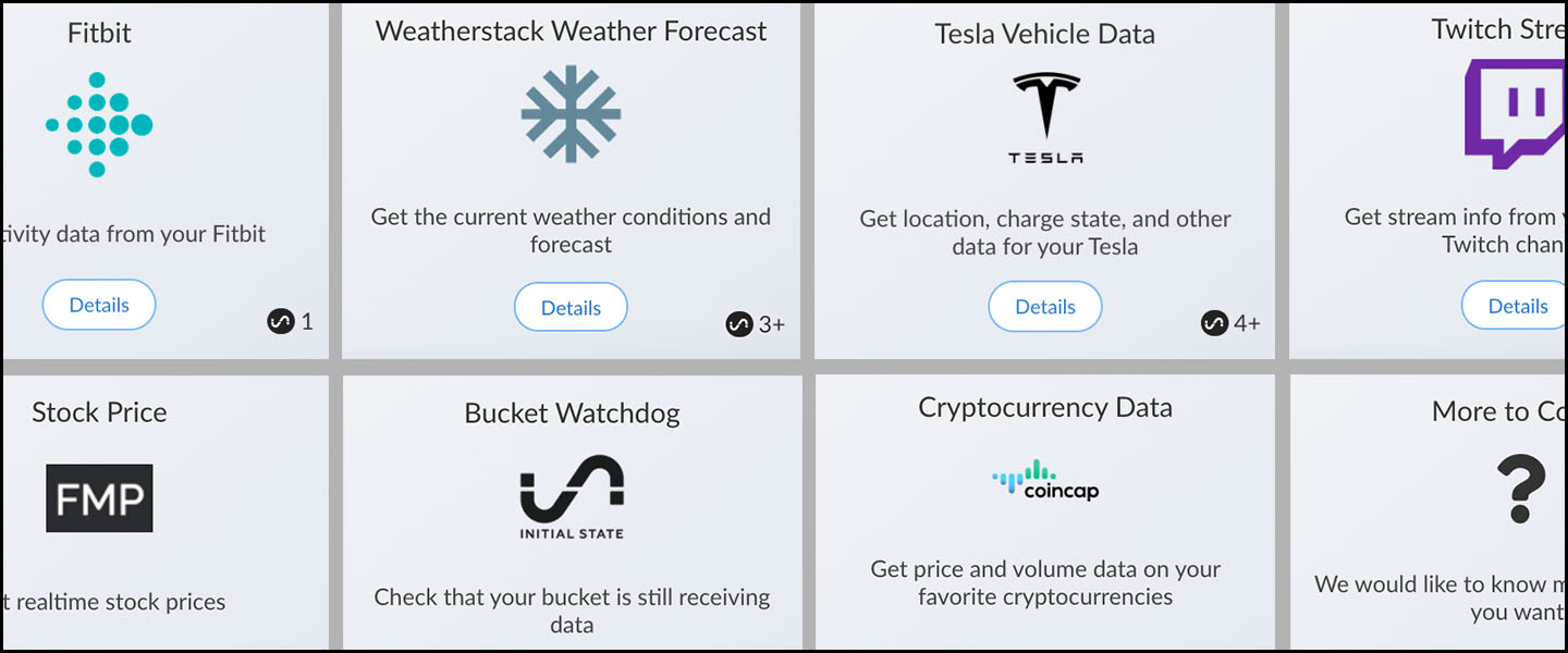
New Data Integration Marketplace
Initial State has launched its newest feature, Integration Marketplace. The codeless data integrations allow users to get data from APIs with just a few clicks. No more having to write code or set up a single-board computer to get the data you want. With integrations ranging from weather to crypto prices to gaming data, you can get more data with just a few clicks. More info ...
April 1, 2020
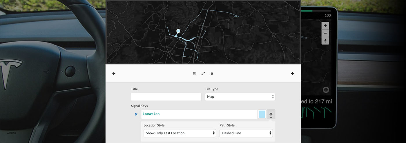
New Map Location and Path Styles
You now have more control over the style of your map location data. Choose from showing dots for all locations, only the last location, or no dots at all. Draw a dashed line path for location history or choose to hide your location history. You also have the option of choosing the color of each location stream. More info ...
March 25, 2020
Line Graph Area Fill and Label
You now have more advanced line graph options to customize your Tiles dashboard. You can fill the area under your line graph with color and edit the label of each signal on hover. More info ...
December 18, 2019
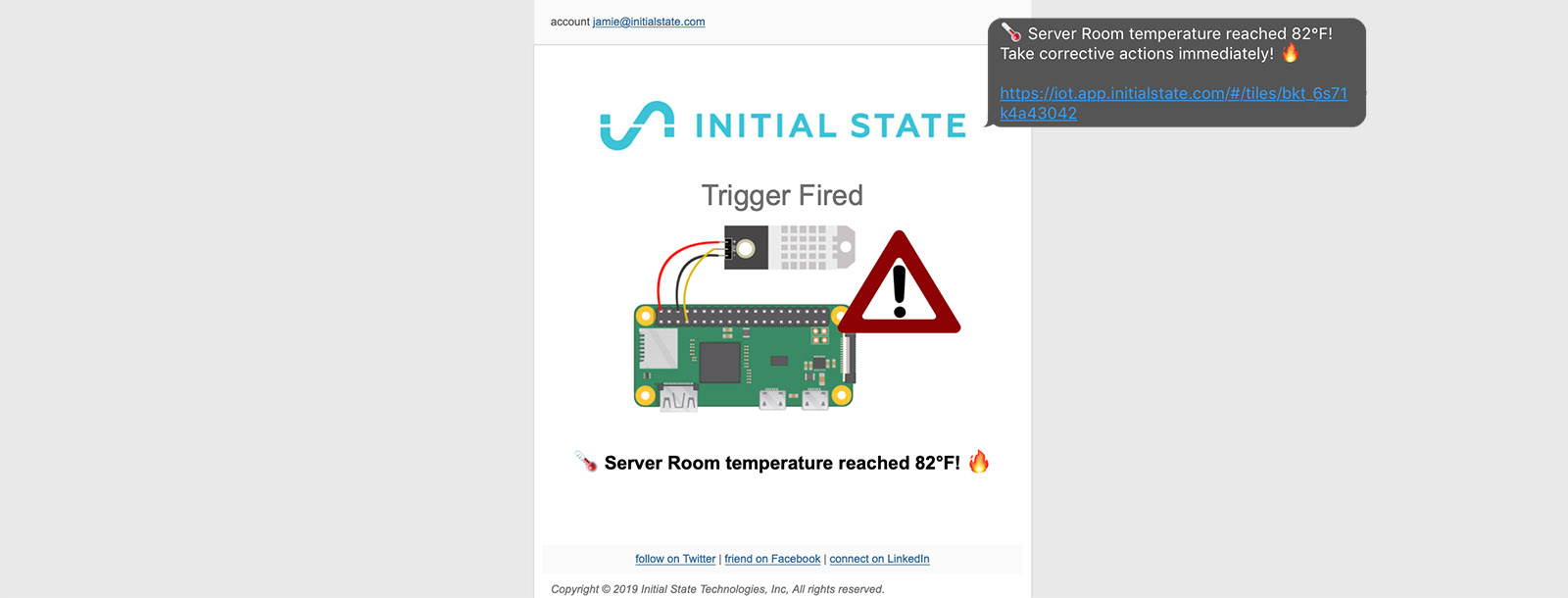
Trigger Message Templates
You can now build your own custom trigger message templates for email notifications and SMS alerts. Add images, links, instructions, emojis, and more to create the perfect real-time trigger message. You can utilize HTML formatting in email message designs for flexible styling and create separate SMS messages for optimized mobile alerts. More info ...
September 13, 2019
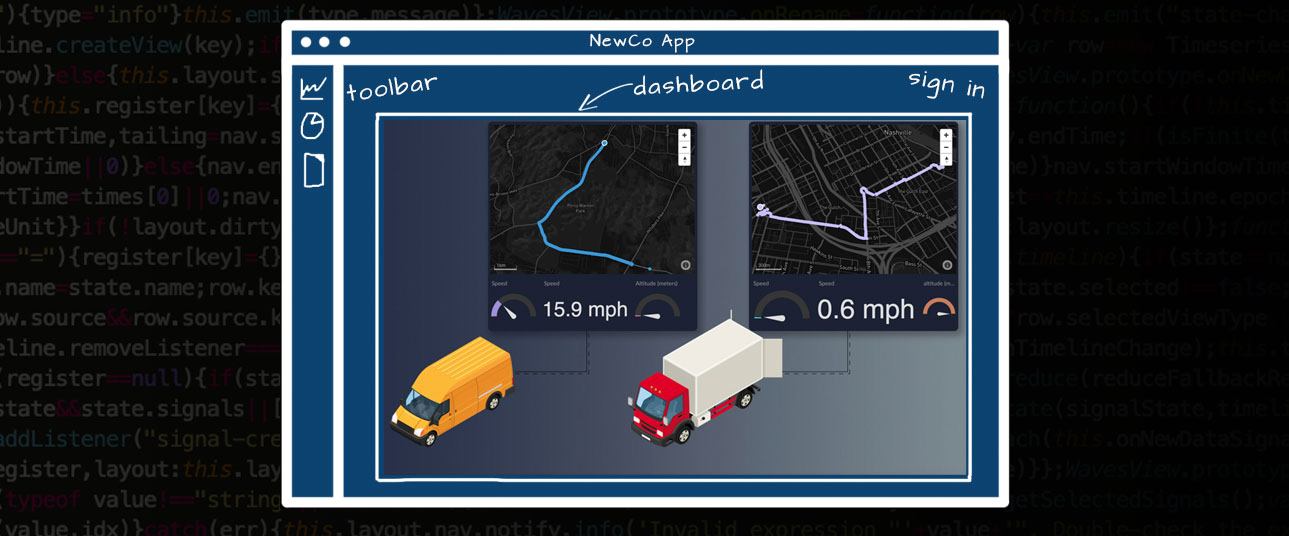
Enterprise Embeds
You can now embed Initial State visualizations into your business's product/app to create a reliable and scalable solution for your data infrastructure. Whether you are in the prototyping phase or scaling to a zillion users, Initial State enterprise embeds allow you to focus on building out your application without having to worry about data ingestion, dashboards, and trigger notifications. More info ...
August 21, 2019
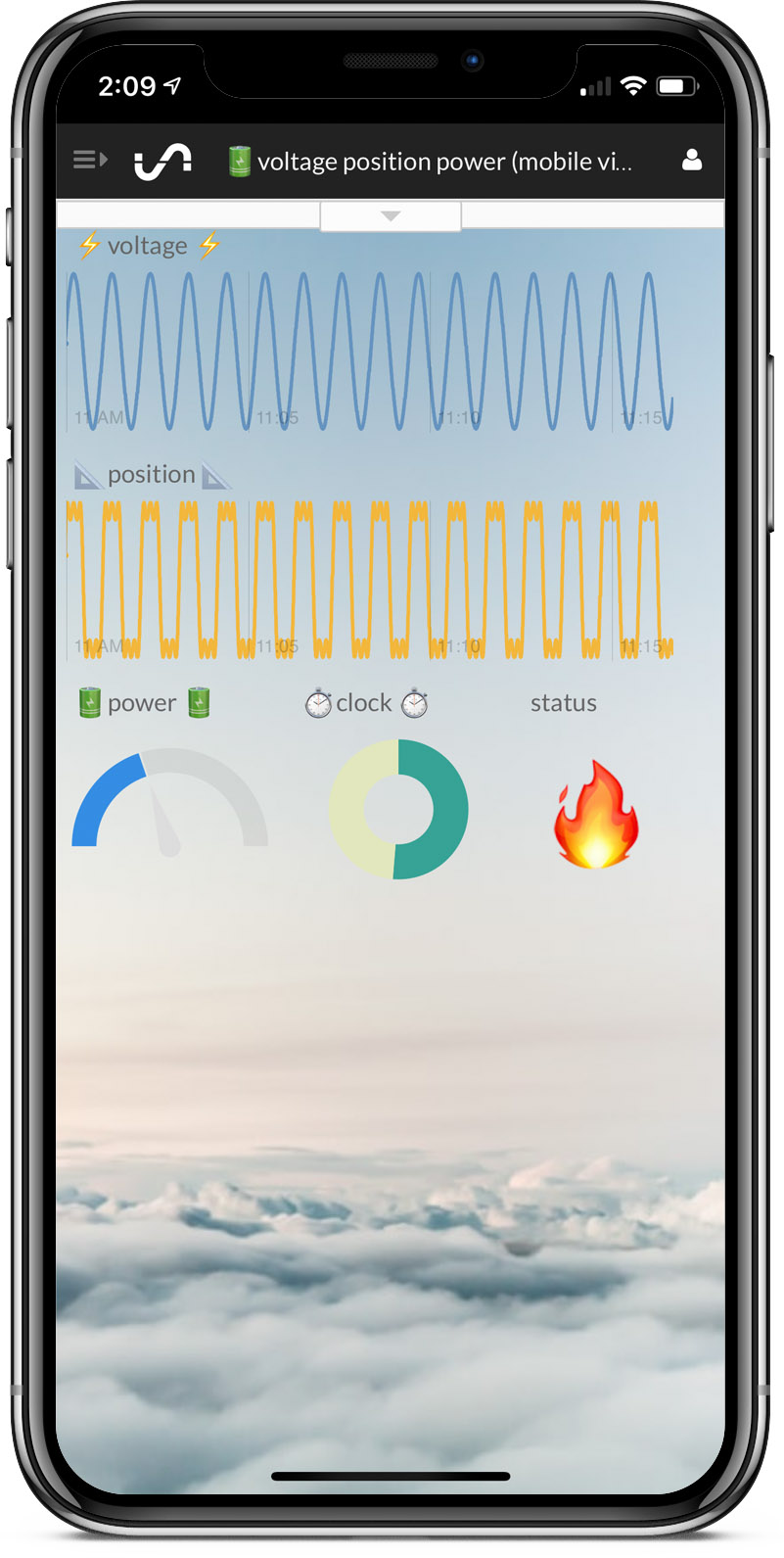
New Mobile Dashboard Layout Control
You now have more control over the layout of your mobile dashboards with smaller tile sizes and more precise tile placement. Create a second view of your dashboard just for viewing on your mobile device, customized to your screen size (which you can even view full screen). Check out the dashboard design templates for mobile specific dashboard designs you can easily import (the mobile dashboard templates have a mobile device in the preview image). More info ...
August 15, 2019
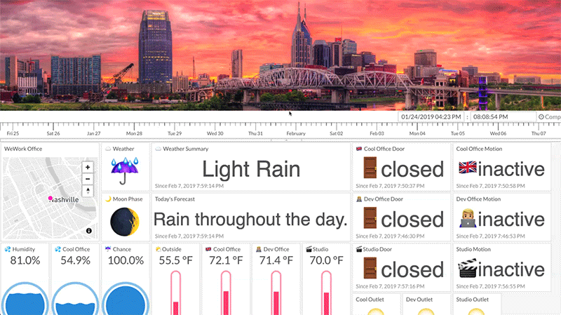
Tiles Image Backgrounds
You can now add a unique dashboard background from one of millions of high-resolution images available from Unsplash. Alternatively, you can provide your own custom images for your dashboard backgrounds. Tiles image backgrounds give you the power to convey data context as well as create personalized (awesome) dashboard layouts. To change your background, click on Edit Tiles and select Change Background from the top menu. You can set tile transparency levels, change background colors, and more advanced options. Check out our new dashboard gallery for inspiration. More info ...
August 15, 2019
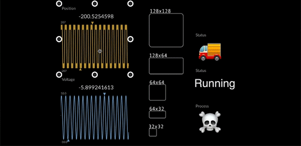
Tinier Tiles
You can now resize individual tiles down to 32x32 pixels. The previous size limit was 128x128 pixels. The smaller sized tiles give you more dashboard design flexibility and more precise tile placement. More info ...
June 12, 2019
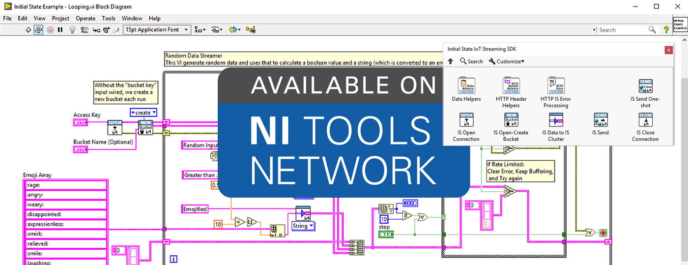
LabVIEW SDK
You can now seemlessly connect your LabVIEW data to a real-time dashboard using the new Initial State IoT Streaming SDK available on the NI Tools Network. The new SDK was unveiled at NI Week 2019 (full recap with photos of our booth and demos). You can learn more about this SDK at our LabVIEW SDK information page.
March 18, 2019
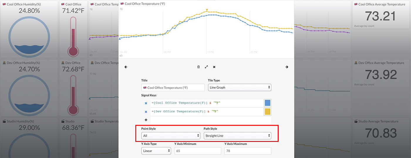
New Line Graph Styles
You can now select from different point and path styles for your line graphs in Tiles. You can select either straight-line, step-line, or no-line as the path style. You can select to draw each data point as a visible dot or not. More info ...
March 6, 2019
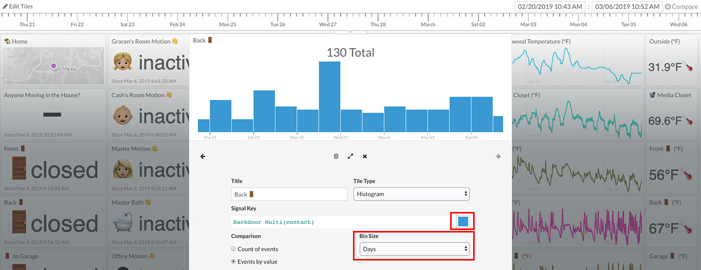
Specify Histogram Bin Size and Color
You can now specify the bin size of histograms to be either fixed (e.g. hours, days, weeks, months) or dynamic based on the time range being viewed. You can also specify the color of the histogram. These new histogram options give you much finer control over this data view type in Tiles. More info ...
February 13, 2019

Load a Specific Time Range (e.g. Jan 1 to Jan 31)
You can now load a specific time range down to the minute. Specify the "From Date" and "To Date" under the advanced settings of your data bucket to load only data from that time range. This option can be used in conjunction with the "Create Multiple Dashboards from One Data Bucket" option to create unique time range views from a streaming data bucket. For example, create a view of November's energy usage or the average temperature last week. More info ...
February 8, 2019
Hide the Timeline in Tiles
You can now hide the timeline in Tiles to create a better full-screen view of your dashboard. More info ...
February 6, 2019
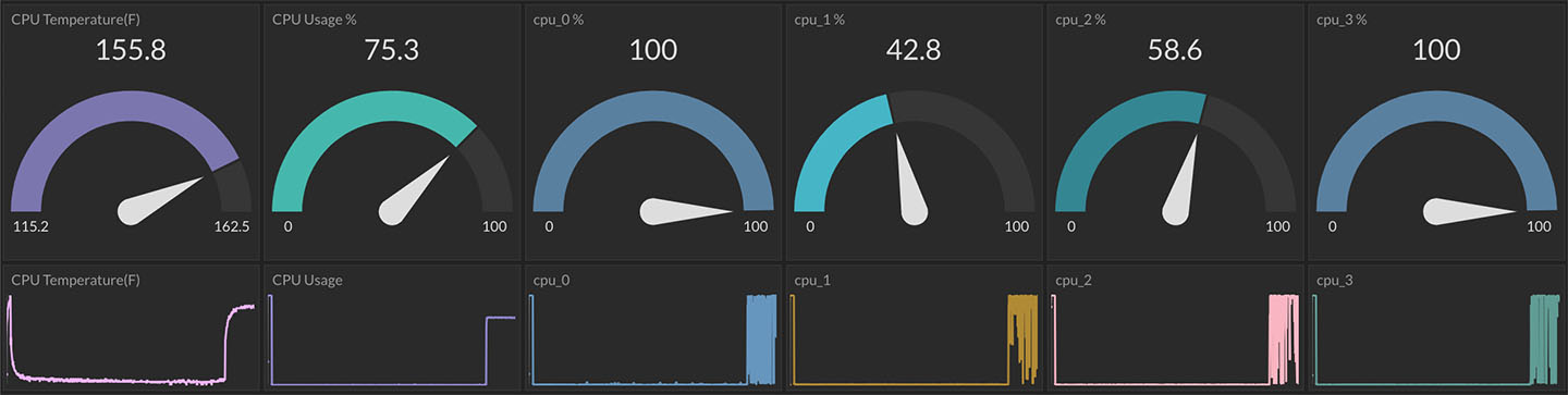
Gauge Color Thresholds
You can now set up your gauge graphs to change colors on value thresholds. For example, change to blue if the temperature is less than 45. Set up as many color thresholds per gauge as desired. More info ...
January 22, 2019
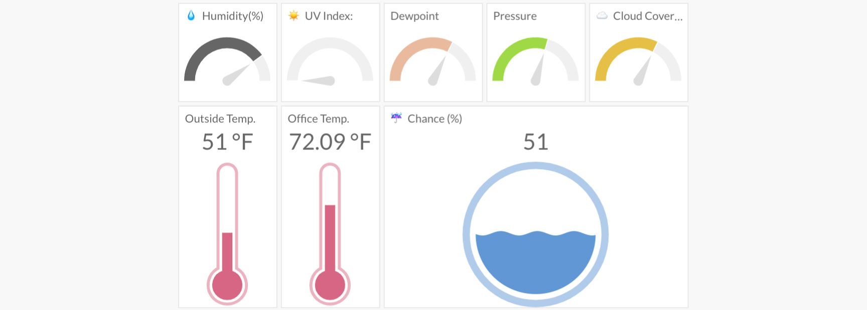
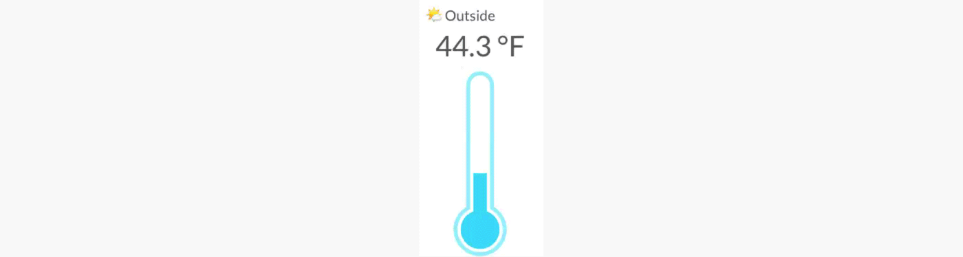
New Gauge Types
You can now choose the type of gauge style to use for your Tiles dashboard. Choose between arc, liquid, and thermometer styles to create a more customized dashboard for your application. More info ...
January 17, 2019
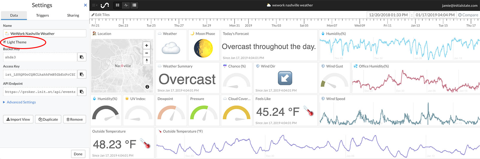
Light Theme
You can now choose either a light or dark theme for Tiles, Waves, and Source by checking or unchecking the "Light Theme" checkbox in the data bucket settings. More info ...
December 18, 2018
Color Gauges
You can now change the color of gauge graphs using the color picker in the Tile Configuration. More info ...
December 10, 2018
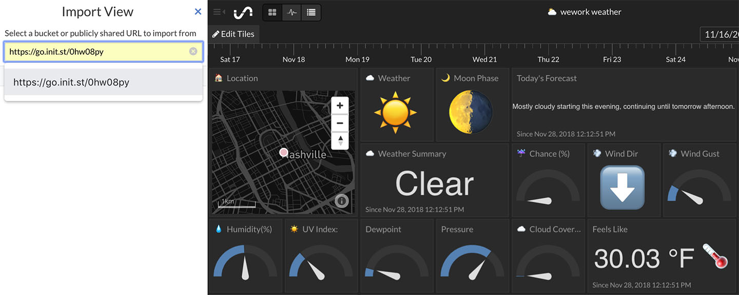
Import a Tiles Layout from a Public Share
You can now import a Tiles layout (tile sizes, names, view types, real-time expressions, etc.) from another data bucket that is publicly shared. More info ...
December 4, 2018
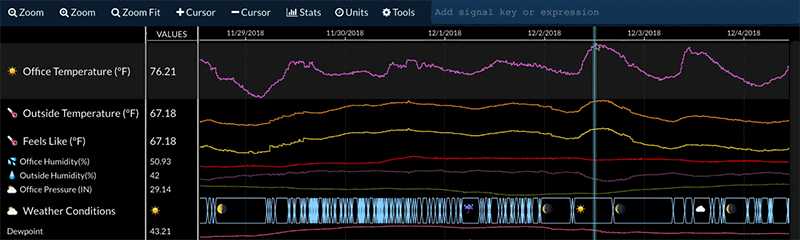
Add a Note or Annotation to Waves
A note or annotation can now be added and attached to a specific signal and timestamp by right clicking on the signal at the desired time and selecting add note. Type the desired text and press enter to add the note. More info ...
November 27, 2018
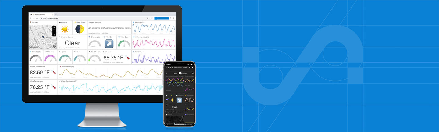
New Data Streaming/Visualization Service Launched
Today, Initial State launched a new data streaming service for individuals. The reason this is a big deal is because this new service is loaded with the features and functions you typically only find in enterprise SaaS with enterprise pricing (i.e. really freakin’ expensive). Our price? $9.99 per month or $99 per year. Oh, and it is completely free for students. More info ...
May 7, 2018
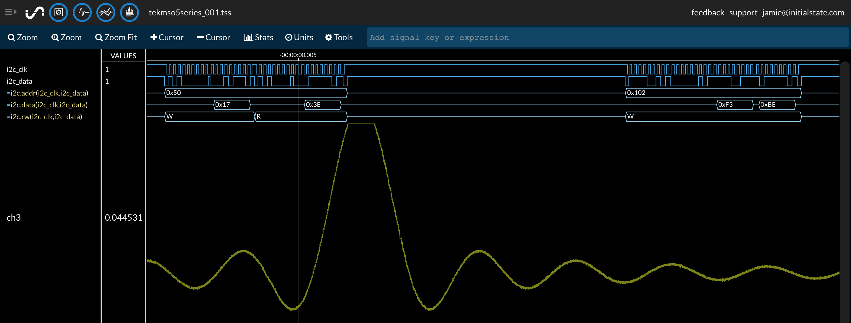
i2c Decode
Real-time expressions now include the several methods for decoding i2c data. The new available methods include =i2c.addr([i2c_scl],[i2c_sda]), =i2c.data([i2c_scl],[i2c_sda]), and =i2c.rw([i2c_scl],[i2c_sda]) which will create new signals for i2c address, data, and read/write respectively. All real-time expression operators and methods can be found here.
April 7, 2018
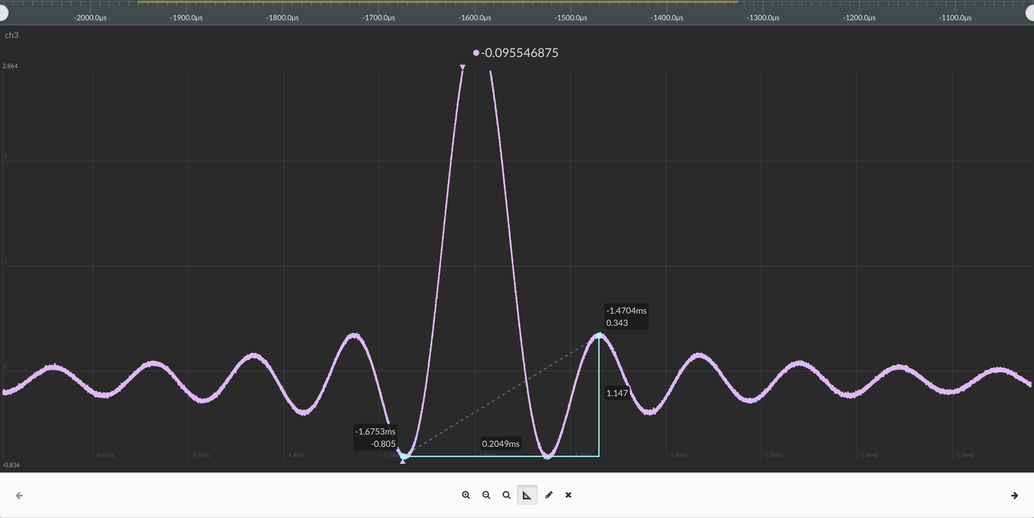
Measurement Tool for Line Graphs
You can now measure both time and magnitude using the measurement tool in Tiles. Expanded tiles drawn as line graphs now have a measurement tool icon at the bottom menu. You can draw the measurement triangle on the line graph to display time and magnitude differences from the drawn vertices. You can drag and move the measurement triangle as well as resize it.
February 6, 2018
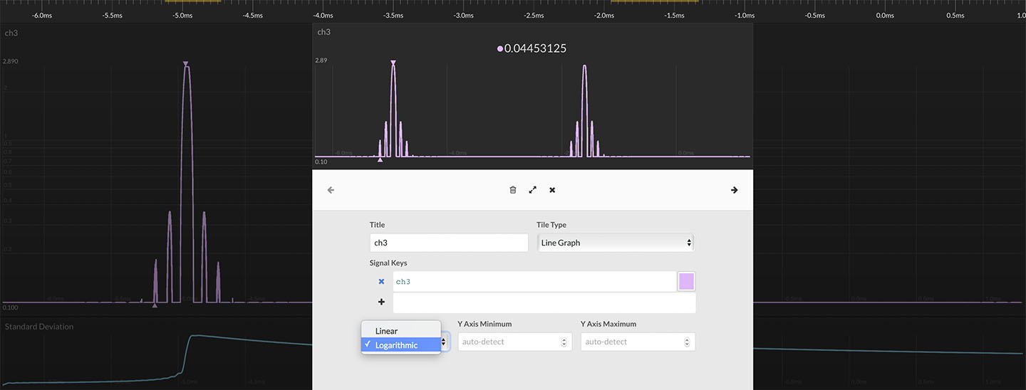
Logarithmic Scale Option
Line graphs in tiles can now be drawn as either linear or logarithmic scale for the y-axis. Choose the y-axis type in the edit tile options when using the line graph tile type. All Tiles line graph options can be found here.
December 21, 2017
Zoom and Pan Line Graphs in Tiles
You can now zoom and pan inside line graphs in Tiles. Simply expand the desired tiles view and use the mouse wheel to zoom in and out. You can click and drag to pan in any direction. Exit the expanded tile view to reset your Tiles dashboard back to the way it was. Read more about panning and zooming inside Tiles line graphs here.
November 6, 2017
Mouse Wheel Zoom Enhancements in Waves/Lines
Your mouse wheel will now zoom in and out of your data by default in Waves and Lines with a more responsive feel. Previously, you had to press the CTRL key to opt into zoom mode with the mouse wheel, but that requirement has been removed. The mouse wheel gives you a convenient way to adjust your zoom level in fine detail while you navigate your dataset. You can read more about panning and zooming in Waves here.
August 28, 2017
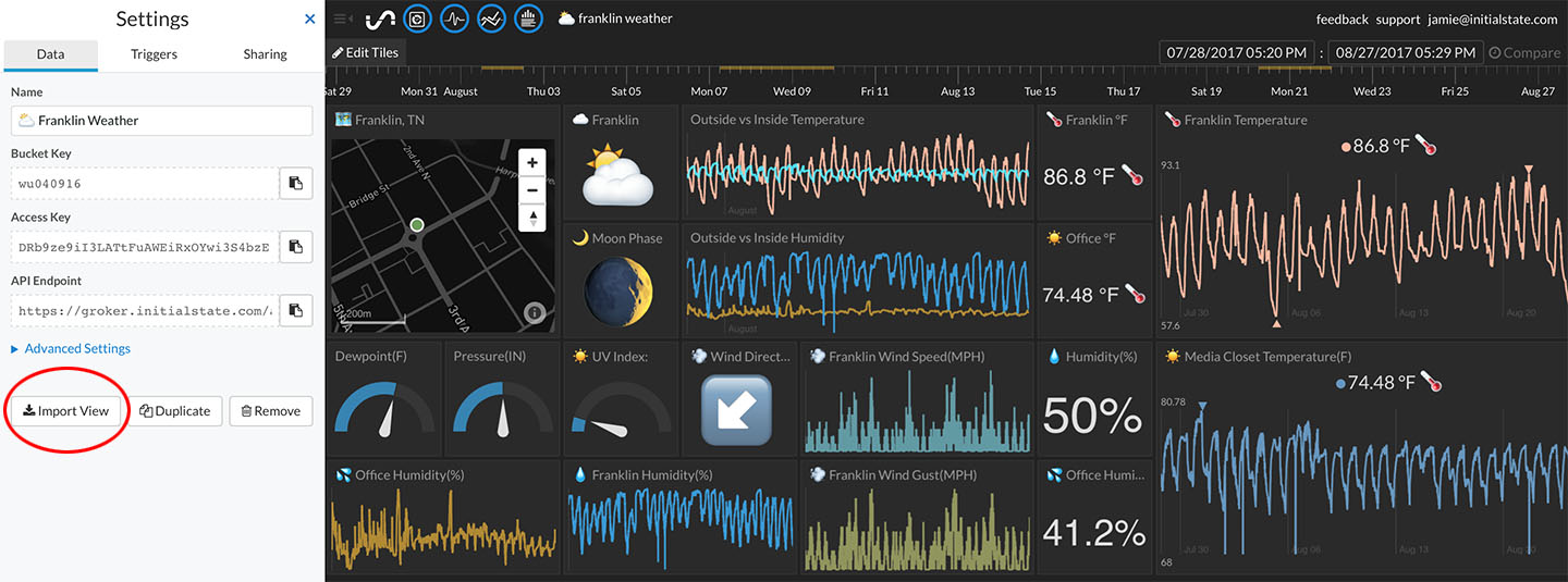
Import a Layout from Another Data Bucket
You can now import a Tiles/Waves layout from another data bucket. Click on the "Import View" button located under the bucket settings and select the source bucket view to import. This will overwrite the existing layout with the source bucket's layout. This option is particularly useful if for utilizing a custom layout as a template for multiple datasets. More info ...
August 21, 2017