An Internet of Things (IoT) dashboard is a data visualization tool that transforms, displays, and organizes a collection of data captured and transmitted by network connected devices. The primary purpose of an IoT dashboard is to provide human readable information-at-a-glance to remotely monitor historical and real-time IoT data.
Introduction
The IoT is an entire industry built on a foundation of data - billions of internet connected devices collecting previously inaccessible and unimaginable amounts of data. Unlocking the value of the IoT means transforming all of that data into information, intelligence, and actions.
There is a lot to unpack in that formal definition of an IoT dashboard. Let's break it down piece by piece to clearly define the requirements of an effective IoT dashboard.
The first aspect of an IoT dashboard is that it is a data visualization tool. Why is a data visualization tool so important to the IoT?
The human brain is capable of receiving 8.96 megabits of data from the eye every second. Let's call that the speed of sight (8.96 Mb/s). The average person can comprehend 120 words per minute reading. That is equivalent to only 81.6 bits of data per second (81.6 b/s). The efficiency difference between seeing and reading is mind blowing (100,000x). The human brain is wired to visualize fast, not read fast.
Understanding the massive amount of information even a single sensor can collect starts with transforming that data into effective visualizations. We need to see the data not read the data. The most common IoT sensors collecting that data include:
Temperature (the most widely deployed IoT sensor by a large margin)
Humidity
Contact
Motion
GPS
Proximity
Pressure
Air and Water Quality
Chemical (including Gas and Smoke)
Level
Accelerometer and Gyroscope
Optical
Voltage/Current/Energy
An effective IoT dashboard must have a set of data visualizations that can effectively display data from these types of sensors over time. Common data visualizations available in an IoT dashboard include:
Line Graphs (the most widely used data visualization in IoT dashboards)
Gauges
Geographical Maps
Summary / Status / Statistics Lists
Bar Charts
Pie Charts
Histograms
Heat Maps
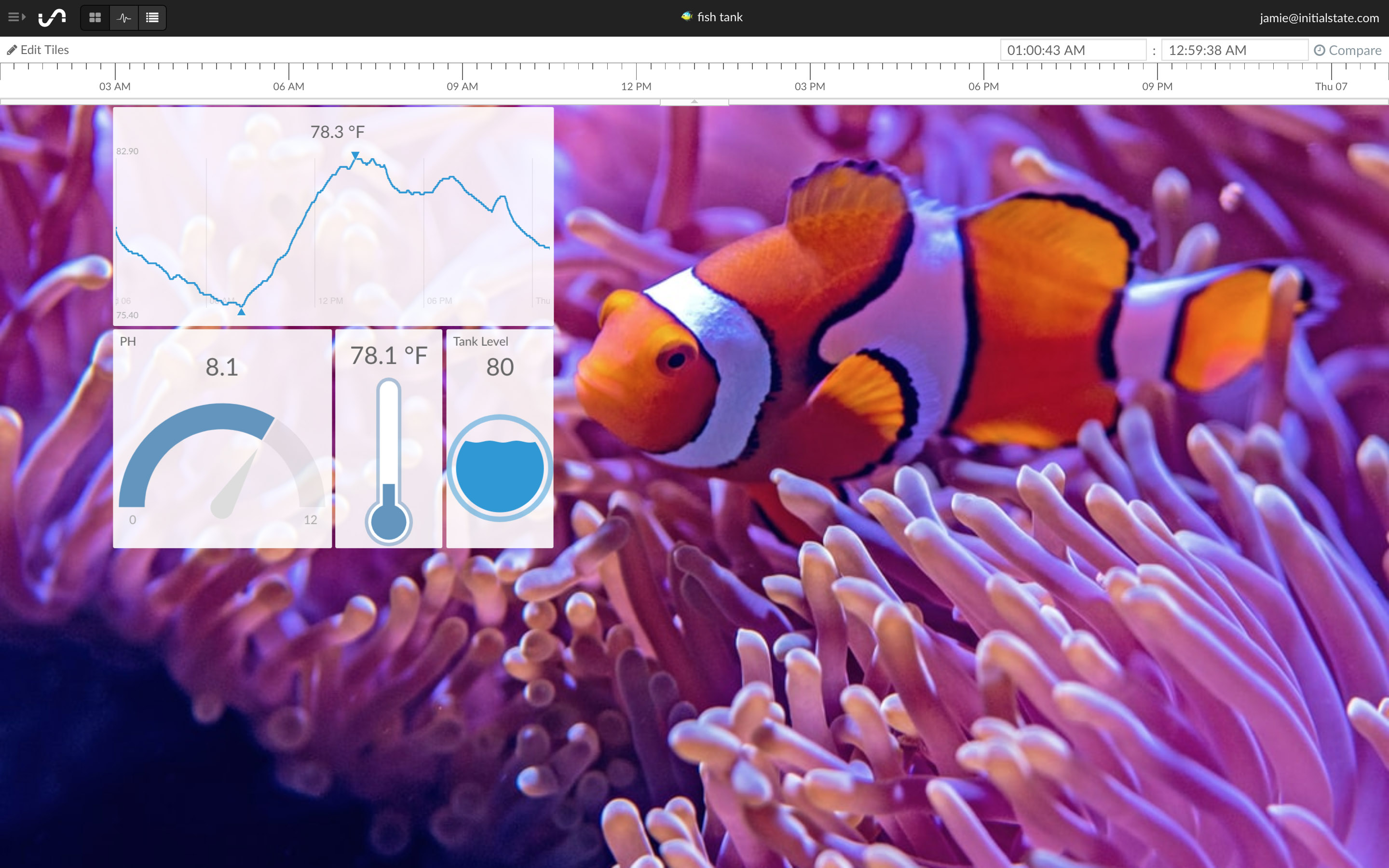
The fish tank dashboard above utilizes a line graph to display temperature changes over time, a gauge graph to show current PH over a PH range, a gauge graph to show current temperature, and a gauge graph to show current water level.
If the primary purpose of an IoT dashboard is to provide human readable information-at-a-glance for IoT data, then a primary function of an IoT dashboard must include the ability to organize that data into an understandable structure. Data organization functions should include the ability to:
Move
Resize
Emphasize
Being able to move visualizations around gives the user the ability to group relevant data sources together as well as create a viewing order for that data. If a user naturally reads from left-to-right and up-to-down then there is a high probability that user will follow the same pattern when looking at a dashboard, especially the first time. What a dashboard designer puts in the top left corner is often the most important piece of information on that dashboard.
Resizing each data visualization inside the dashboard gives a designer the ability to optimize that view for both the visualization type as well as the amount of data being viewed over time. For example, a 2D geographical map view will often be much larger than a pie chart. Resizing is also a form of visual emphasis. A line graph that is the largest visualization in a dashboard will draw a viewer's attention.
Emphasizing importance or drawing attention to something critical helps a viewer visually navigate a complex dashboard. In addition to size, color is another effective visual emphasis attribute. A gauge that is bright red may indicate an out-of-bounds scenario that requires attention. Animations and images are useful tools of emphasis. If something is on fire, an image of a flame on a dashboard has more visual emphasis than writing "Engine on fire" in a status box.
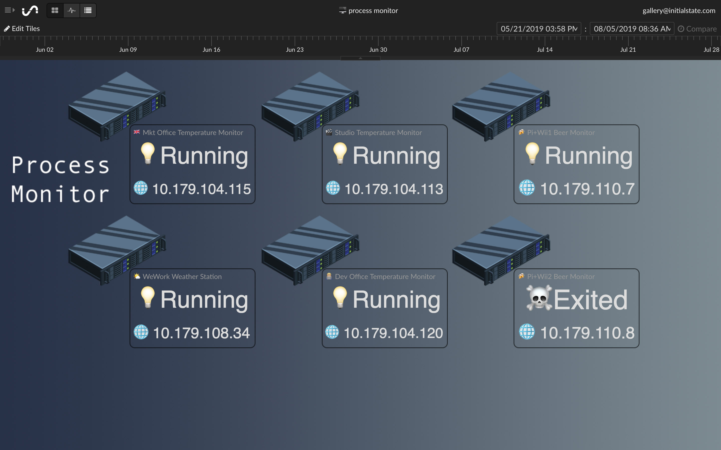
The process monitor dashboard above groups data from individual servers together for organization and utilizes images (emojis) to visually emphasize the status of each process.
Data Storage
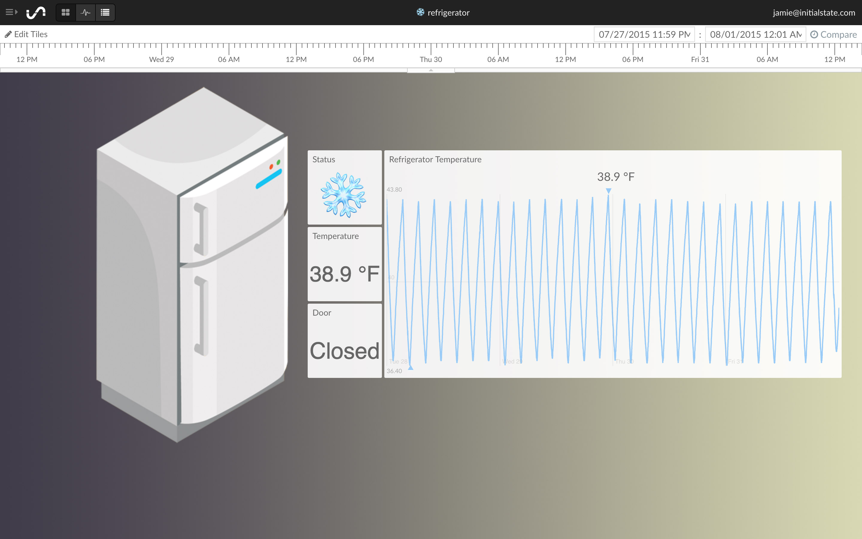
Refrigerator Monitor Dashboard Built on Initial State.
The majority of deployed IoT devices are small, lightweight sensors with some means to communicate to the internet either directly or through a gateway. This means that the majority of IoT devices have limited built-in data storage. One of the biggest values of IoT data is analyzing that data over time. The type of data an IoT dashboard will process is known as time-series data (data with a timestamp). It needs to be stored somewhere.
IoT devices will "push" data to a data store where it will either come with a timestamp or be timestamped on receipt then stored into a database of some sort. An IoT dashboard will read and process data from this database to create the data views.
IoT devices can produce a lot of data over time! An effective IoT dashboard will be able to efficiently load and display large amounts of time-series data (i.e. millions of data points) from the attached data store. Some IoT dashboards are hosted (i.e. available entirely from a remote location in a web browser) and coupled with their own data stores to create an optimized user experience. Other IoT dashboards can be generically configured to work with a variety of data storage systems including local databases (i.e. on-premisis data storage).
The refrigerator dashboard above displays a history of temperature data to ensure the refrigerated product has never been exposed to temperatures outside its required range.
With IoT devices being deployed in mission critical applications, processing data in real-time becomes an important aspect of IoT dashboards. Real-time data is data that is delivered and processed with extremely low latency. In addition to displaying historical data, effective IoT dashboards must be able to immediately update when new data arrives.
This means effective IoT dashboards are not static visualizations because most IoT applications are actively sending data. Dynamically updating data visualizations are more difficult to build than static visualizations.
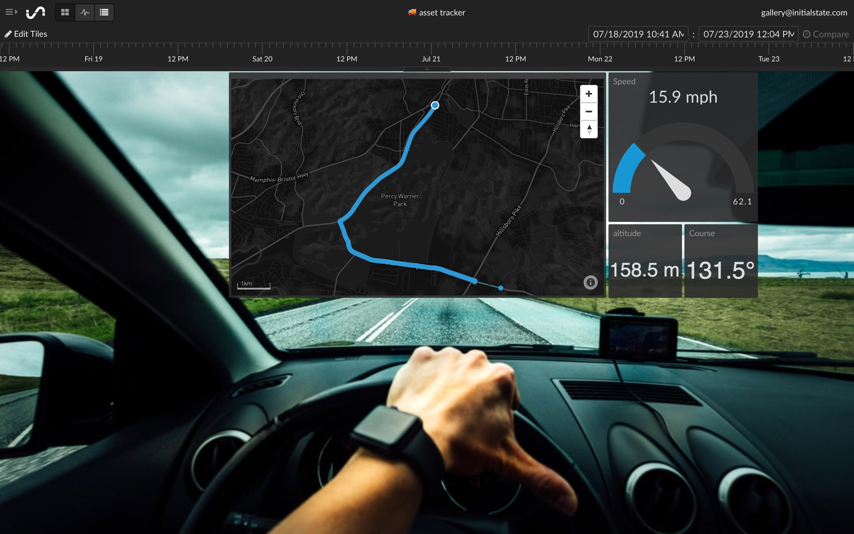
The GPS tracking dashboard above displays real-time location data on a map along with current speed, altitude, and direction information.
Data Analytics
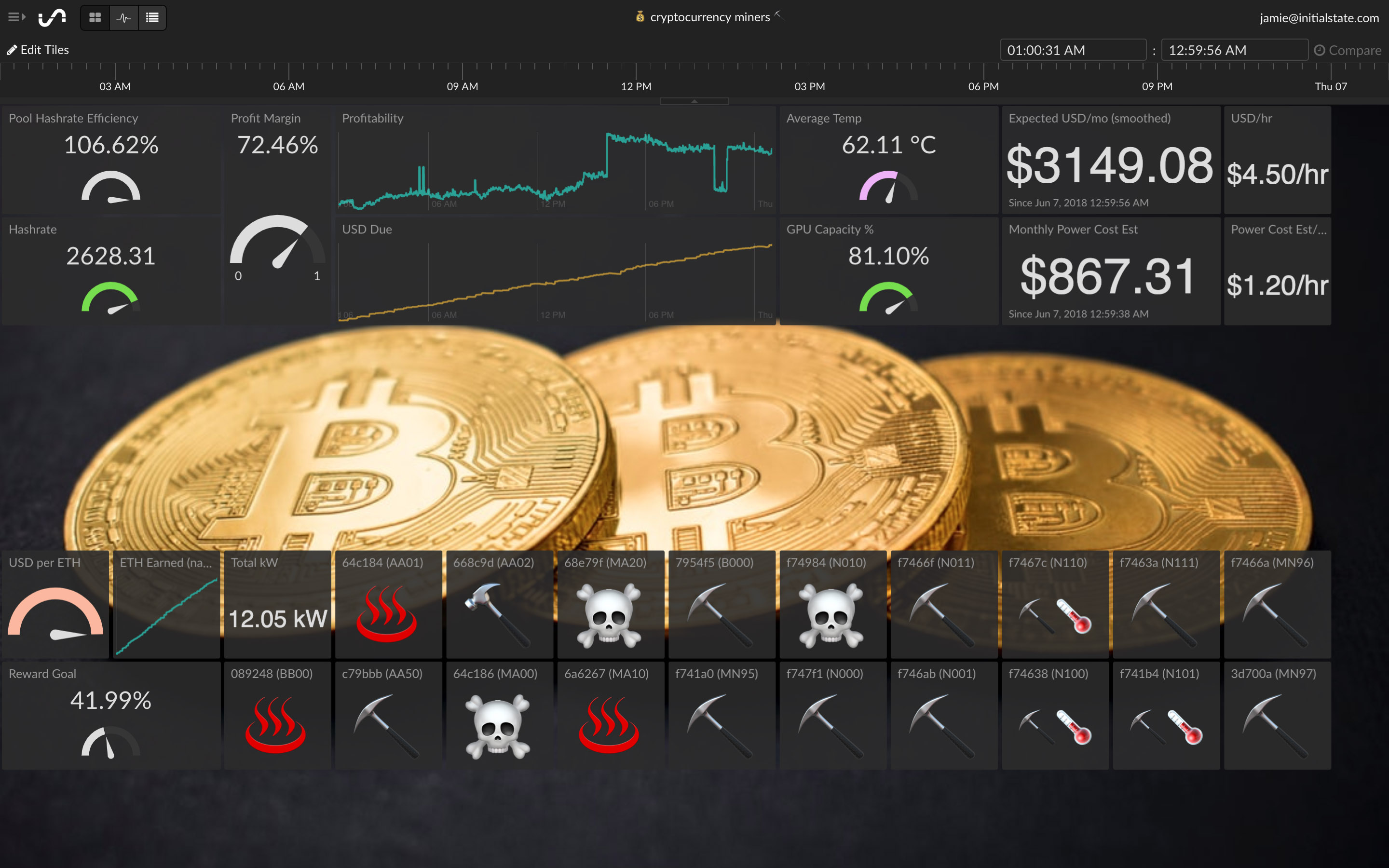
Cryptocurrency Miner Monitor Dashboard Built on Initial State.
Turning the vast amount of IoT data into information often requires some form data analytics. Simple data analytics functions commonly found in IoT dashboards include processing basic statistics from an IoT data stream such as min, max, and average. Advanced data analytics capabilities include functions such as trend analysis, diagnostic analysis, and predictive failure analysis.
Effective IoT dashboards will have some form of data analytics capabilities built-in to help users extract information from IoT data. The level of complexity of those analytics functions varies widely. For example, advanced IoT platforms leverage machine learning on large IoT data stores to recognize statistically significant trends and provide corresponding alerts.
The cryptocurrency miner monitoring dashboard above dynamically computes and displays profitability and hashrate efficiency in addition to basic miner status information.
Data Security
At no point in an IoT data point's life cycle should that data ever be exposed to poor security. Best practice data security should be applied at every stage of the data pipeline from data ingestion to data consumption.
If an IoT dashboard has its own data store, its APIs should require encryption for data in transit as well as encryption on read. Data at rest should also be properly secured to minimize the possibility of it being compromised.
Any IoT dashboard that fails to implement proper data security functionality should be disqualified from consideration.
Conclusion
Evaluating an IoT dashboard involves analyzing its many functional aspects including data visualizations, organization, storage, analytics, and security. Not to mention performance, features, UI, UX, and platform (e.g. web-based, mobile app, local-install). Great IoT dashboards are hard to build but easy to use.